*******
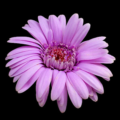
So let's see what we can come up with. Image>Adjustments>Hue/Saturation>Hue. By taking the hue slider 3 points to the right, we get a slightly more vivid pink. If we go further to the right, we start getting into orange which clashes with our pink. Going still further, we get a yellow which doesn't look good and I don't want to get into an unnatural blue or green. I also want to avoid bright red, so this lavender seems to be our best option.
 I make a note that I have adjusted the hue to a minus 32. This gives us two images of different hue which is going to add interest to our final image. Now, we can go back to extract 1 and create a lavender duplicate of that.
*******
We now go on and use the same procedures to complete extractions 3, 4 & 5. As I worked with these, I settled on using a tolerance level of 11 or 12 in using the magic eraser.

No comments:
Post a Comment