Wednesday, March 31, 2010

Butterfly Tutorial Lesson 8


This is one of many variations we could do with our colors. I have used bright colors here, but you could use more subdued colors and be as subtle as you want to be. Do you see the possibilities? Have fun with this!

Butterfly Tutorial Lesson 7


This is where the fun begins and our hard work pays off. You can now take any layer of color and change it to any other color you want. In Photoshop, go to layer>layer style>color overlay. It will bring up a box which allows you to change the color to any you choose.
*******
Here, I have stuck with the same three colors, but shifted them around to different layers. It gives the butterfly a very different appearance. More importantly, for our mandala design, it gives us more variety to work with.
*******
You could use the fill tool to accomplish this, but I find that color overlay gives better results in less time.

Butterfly Tutorial Lesson 6


Put all the layers together, and this is the result.

Butterfly Tutorial Lesson 5


Here we add a layer of white. One can work even faster on this layer because it will be covered by both the blue and pink layers. You can see that I allowed quite a bit of overlap here.
*******
This a a basic approach we can use with this type of painitng. Each successive layer will be below the preceding ones and allows for quick addition of the color field. We could expand on this process, by adding smaller areas of more detail and extending our color palette to more hues. For our purposes here, this is enough detail and is sufficient to demonstrate the process.
*******
This is an approach that can be used for all sorts of subjects. Flowers could be done this way. Instead of using photos directly, they could be turned into digital paintings and varied as needed. I will be experimenting with that. One can combine flowers and butterlies in one mandala.
*******
This technique could be used for other kinds of designs as well as the mandalas. Anytime you want to be able to vary the color scheme on a design, this is a way to set it up. I could see doing this with fish, birds, turtles and lizards, angels as well as people in costume. I am sure you can find other applications.

Butterfly Tutorial Lesson 4


I set a new layer and used the same technique to color in this pink which is sampled from the original photo. Note that I can be sloppy about letting this layer overlap the edges next to the blue, because it is going to be below the blue layer and the overlap will be covered. This allows one to work faster at this stage. I have to be more careful where the edge will meet the next color of white.

Butterfly Tutorial Lesson 3


After creating a new layer, I used the eye dropper tool to sample the blue on the photo and set it as the color for my paintbrush. I could use any color I wanted and will vary them as you will see, but I wanted to start with the natural colors of the original.
*******
I zoomed to about 100-200% so that one wing fit my page. Again, with brush set to about 10-12 pixels; I filled in the area with the blue. I am starting with the largest area of color. This layer is quite a bit of work, but it makes succeeding layers easier. Again, I can use my eraser tool to clean up the edges and by placing this layer beneath the outline, I get the image you see here.

Butterfly Tutorial Lesson 2


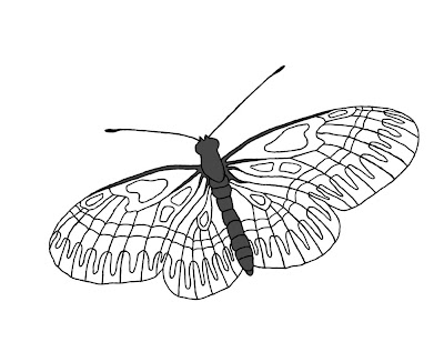
I opened the photo in Photosshop and added a new layer. I then zoomed in to 400% and set my foreground color to black. I then set my paintbrush to 2 pixel diameter and traced the outline you see here.
*******
I then created a new layer and set my color to 80% gray and my brush to 10 pixels. I reduced my zoom to around 100% so that the whole body just fit onto my page. Using an electronic pen and drawing tablet, I filled in the body with the gray.
*******
If you are using 100% opacity for you paintbrush color, then you can stop and start as much as you want; and you will get an even coat. If, however, you were using less than 100% opacity, then you would need to leave the pen down on the tablet without lifting it until you got the entire field filled. This gives an even tone to the color, whereas if you lift the pen and paint more; you get an overlapping of color and uneven tone.
*******
This would apply here if you wanted to mix 2 colors together. You could set them each at 50% opacity or 60-40 and so on. I often fill with reduced opacity when workig with flower photos to boost the color in an area. It is especially helpful where the photo has some white out from overexposure. That is a common occurance here in Tucson when taking a photo in full sun.
*******
I didn't have to be too precise about the edges for two reasons. First, by placing the gray layer below the balck outline, the black lines cover some roughness. By zooming back up to around 400%, I can also use my eraser to tidy up the gray to fit my boundaries.
*******
I then merged the gray and outline layers into one. You could leave them separate if you want to vary the body color.

Butterfly Tutorial Lesson 1


I am working toward a mandala made with butterflies instead of flowers. I envision a whole series of them. I will post the finished design upon completion, but I want to show you the technique of creating the digital paintings of butterflies that will be the elements for the mandala.
*******
I start with this photo of a butterfly downloaded from the internet. Flickr alone has over a million butterfly images, many of which are available for free download. For our purposes, the resolution is sufficient.

Saturday, March 13, 2010

Stones Overlay Pattern 1.


I call this a stones pattern because it reminds me of a field of stones or pebbles. I created it by drawing the grouping of ovals of varying sizes. While this pattern is not that exciting, it demonstrates a technique that can be used to create a host of patterns, some of which will be more interesting than others. As I work with this concept, I develop a better idea of what will create dynamic patterns.

This and other patterns using this line technique can be used either as a background or an overlay. You budding artists out there, can have a lot of fun with this concept.

Blurred Triangle Mandala with Fan Overlay


I created this overlay pattern which I call a fan pattern, by grouping radiating lines. There are many possibilites for creating interesting, pleasing patterns this way.

Blurring the mandala to varying degrees, produces a range of interesting effects.

Triangle Mandala 1


I took triangular sections out of flower petals to create the elements for this design. I am not entirely satisfied with this mandala, and am not posting it for sale, but it serves as a demonstration project. I learned a good deal from the process of creating it and it opens new possibilities for me.

What I want to show you here is that we can take many of what I have called background patterns and turn them into overlays which can be superimposed over a mandala. By blurring the mandala, we can turn it into the backgound.